
Only Learn Basic Graphic Design Tools
Lets, get Started...
- Typography
- Color Scheme
- Images
- Branding & Identity
- Logo
Typography is everywhere we look. It's in the books we read, on the websites we visit, even in everyday life—on street signs, bumper stickers, and product packaging.
But what exactly is typography? Simply put, typography is the style or appearance of text. It can also refer to the art of working with text—something you probably do all the time if you create documents or other projects for work, school, or yourself.
Common types of fonts
Typography can be an intimidating subject, but it doesn't have to be. You only need to know a little to make a big difference in the stuff you do every day. So let's get started. First, some common types of fonts and what you need to know about them.
- Serif fonts
- Sans serif fonts
Choosing a font
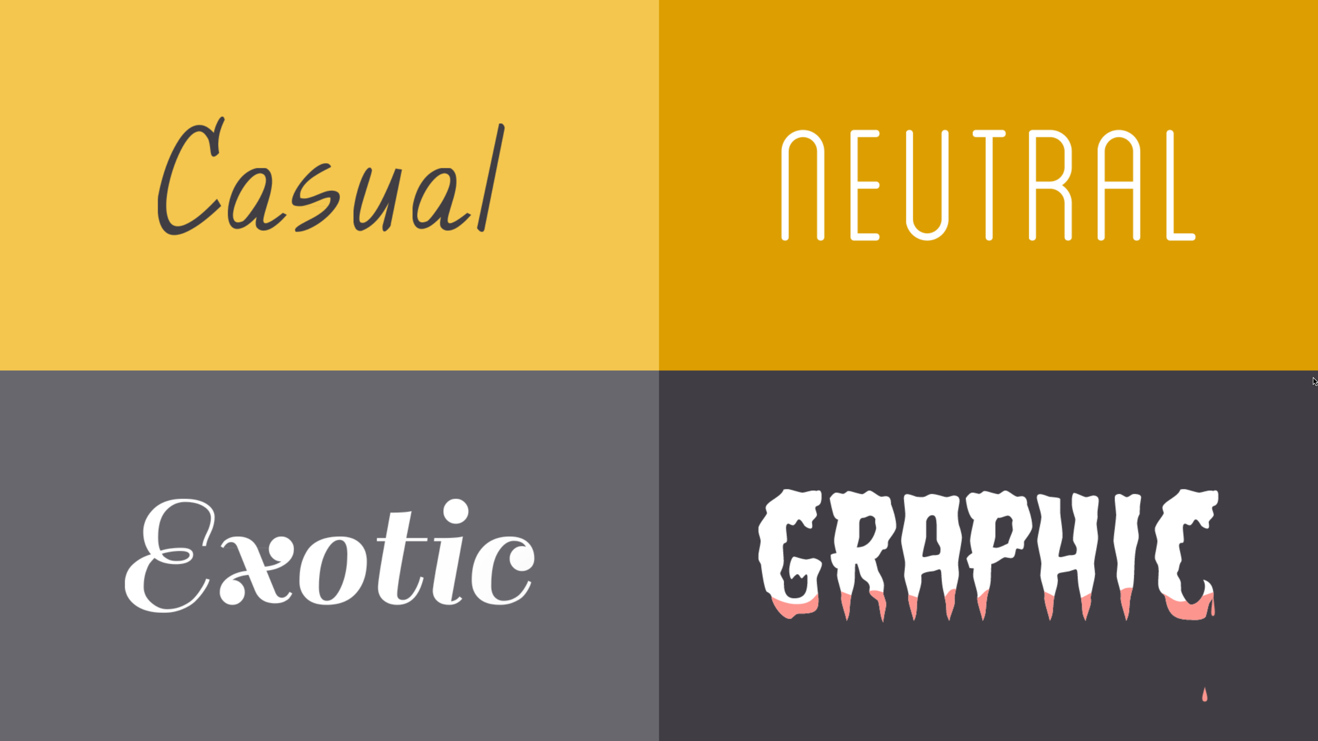
In a way, fonts have their own language. They all have something to say beyond the words on the page. They can come across as casual or neutral, exotic or graphic. That's why it's important to think about your message, then choose a font that fits.
Fonts to avoid
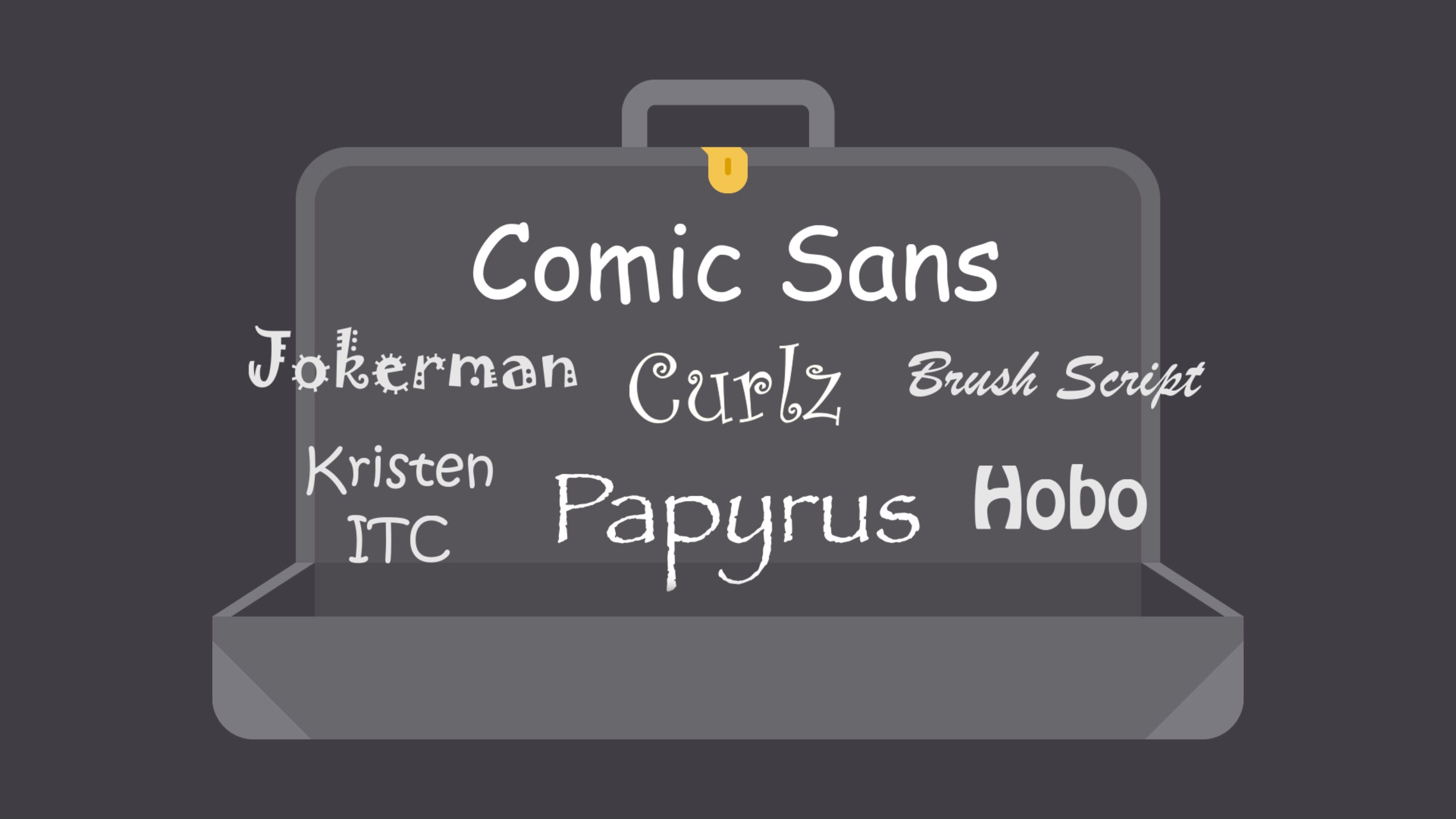
Some fonts come with extra baggage, including Comic Sans, Curlz, and Papyrus. There's nothing particularly wrong with these fonts—they just have a certain reputation for being outdated and overused.
If you find yourself tempted by them, think twice and consider using something else. There are many fonts with a similar look and feel that are less likely to detract from your message.
Color
The power of color
Color plays a vital role in design and everyday life. It can draw your eye to an image. Sometimes it can trigger an emotional response. It can even communicate something important without using words at all.
Creating color schemes
So how do we put this all together to create professional-looking color schemes? There are actually tried-and-true formulas based on something called color harmony that can help.
Color harmony uses the color wheel to illustrate time-tested color combinations. We'll explore some of the most common types of harmony below.

Avoiding common mistakes
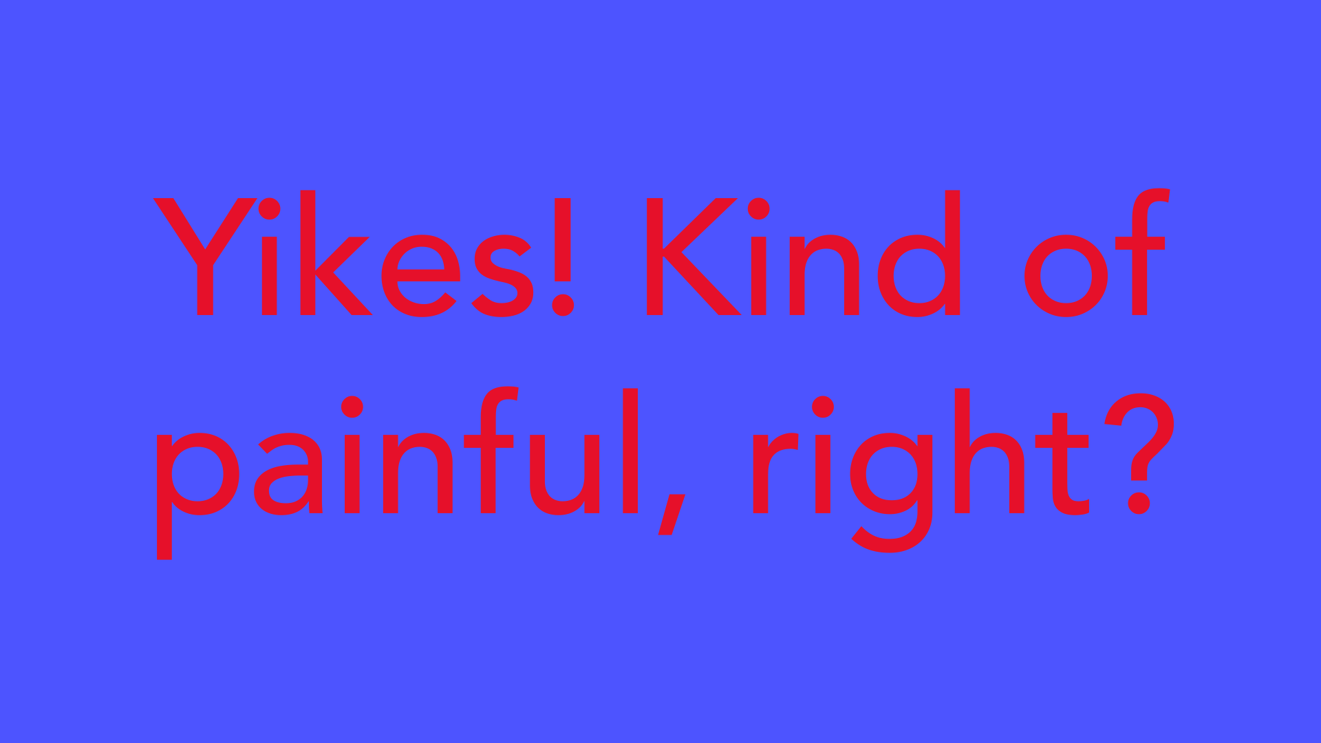
There are a few classic dos and don'ts when it comes to color. For instance, have you ever seen colors that seem to vibrate when they're placed next to each other?
The solution is to tone it down—literally—and there's a simple way do it. Start with one color, and try adjusting its lightness, darkness, or saturation. Sometimes a little contrast is all your color palette needs.
Readability is an important factor in any design. Your colors should be legible and easy on the eyes, especially when working with text.
Sometimes that means NOT using color—at least not in every little detail.
The power of images
Images can be a powerful force in design. No matter what the subject, we're naturally drawn to them. From beautiful, high-definition photos to carefully crafted graphics, they're usually the first thing we see.
However, images aren't just for decoration. In design, they're the hook that draws the viewer in. Compelling visuals can help you connect with the audience—and make a strong impression—before they've even read a single word.
Finding images
You don't have to be an artist to use images in your work. All it takes is a little creativity and a willingness to think outside the box. With the right resources, you can learn to set your designs apart. First: finding high-quality images for almost any type of project.

The importance of quality
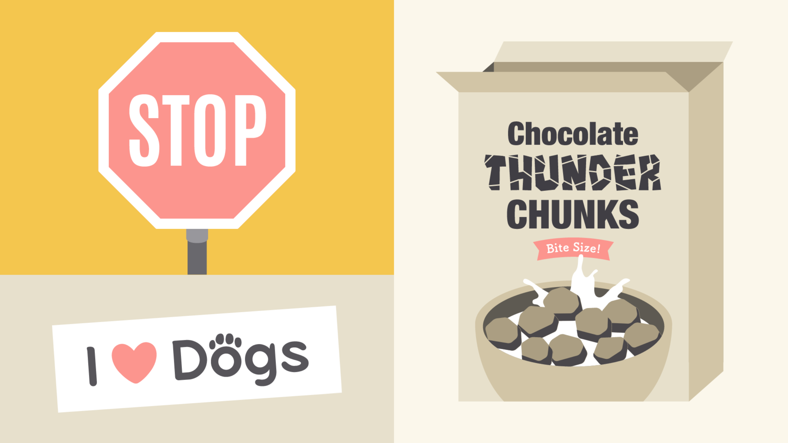
Of course, it's not just about content. There's also a technical side to images, which can have a big impact on your design. It doesn't matter if the photo you've chosen is absolutely perfect in every other way. If it's blurry or pixelated, it could give the wrong impression.
Strong visuals can be very persuasive. Think of your own experiences as a consumer. Have you ever chosen a product simply because you liked the way it looked? Understanding visual identity can help you make more thoughtful design decisions, regardless of your role, medium, or skill level.
Logo Designing
A logo is what identifies your brand using a particular mark, type design, or both. The most effective logos tend to be fairly simple—something viewers will recognize and remember.
Every element of your logo contributes to your brand identity, including your font choice, colors, and other imagery. Change even one of these elements, and it can have a big impact on the way your brand is perceived.


